Moleskine Digital Notebook


We focused on the integration of a social networking feature into the Moleskine App, enabling users to interact with one another and engage with each other's content. we wanted to keep the original app's color scheme to ensure user familiarity.
ROLE
Lead of Design
Behavioral Researcher
TEAM
Jenny
Kayla
DURATION
2 weeks
___Problem
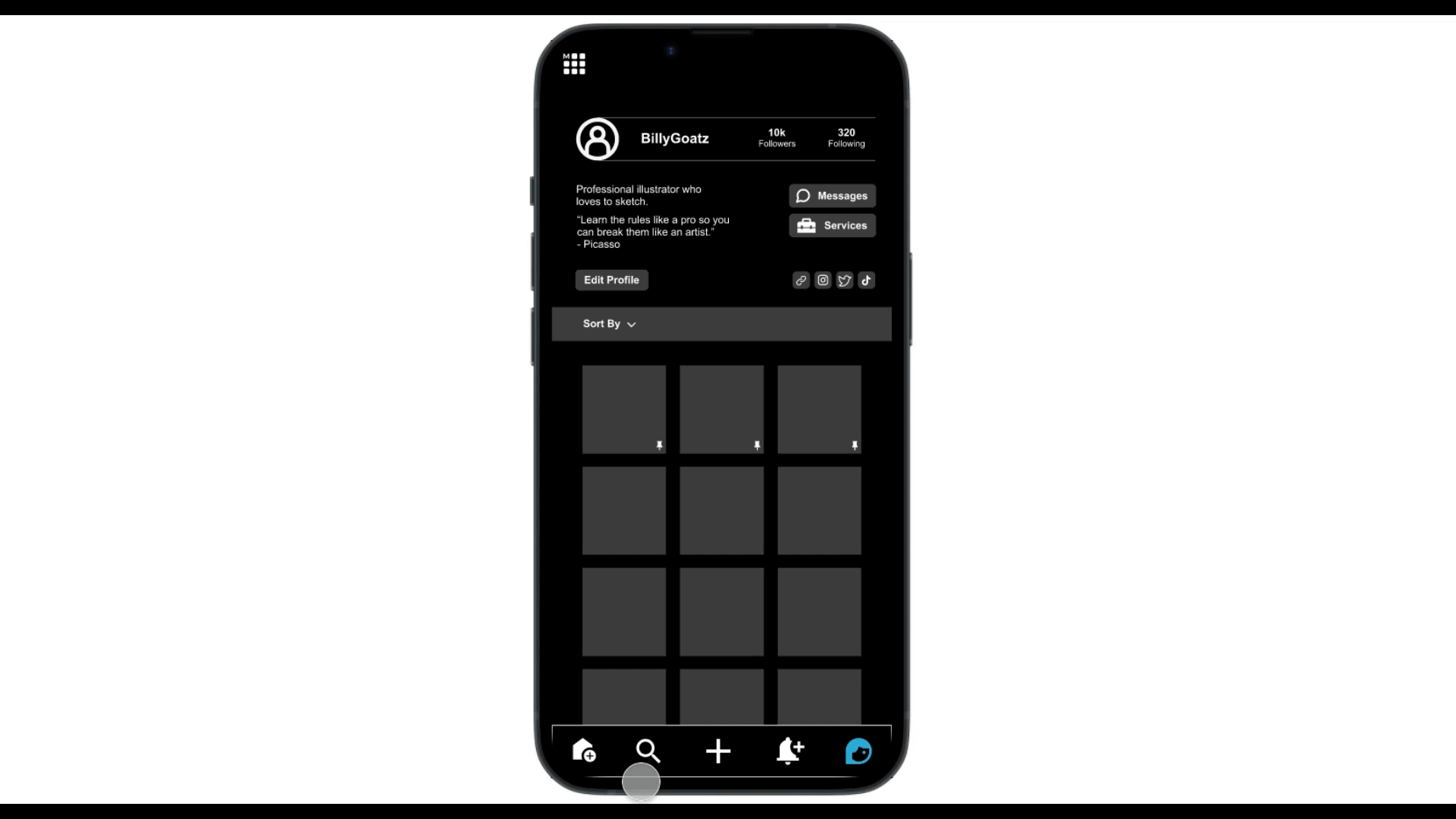
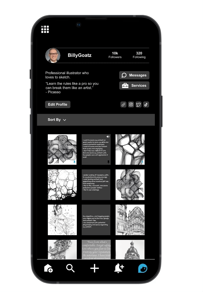
We wanted to create a seamless space for Moleskine Artists to share their work within the community.
Given the app's limited color options, the challenge is allowing users to connect and interact with fellow content creators.
Trends Features
AND

Competitor analysis
Our research shows that with 2 billion monthly active users Instagram is ranked as the 4th most popular social network by number of users. We've also examined other popular social media/ artistic apps to assess their features and strengths.

_____generated by me using AI
Wireframes:
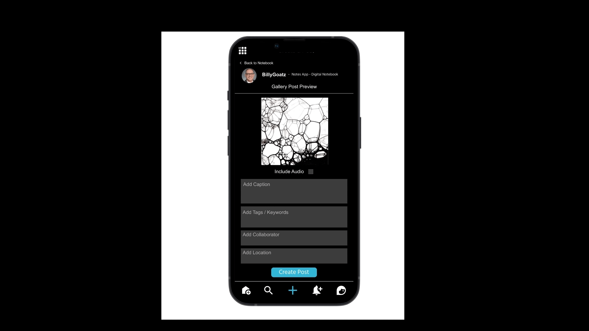
_____Creating a post:

_____Contact:

How did we come up with our Prototyping?
Our goal was to provide a feature where users could connect, showcase their art, and potentially find new clients!
I involved stakeholders such as end-users in the process to gather feedback and make necessary adjustments to the feature. By following Agile principles, we were able to effectively manage the project and ensure that the end result met the needs of all stakeholders and delivered value to the customer.
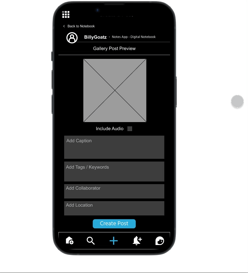
Users have the option to add captions,
audio, hashtags, collaboration, and
location before posting any art.
Having the option to filter by group and search
was another fun feature we thought about.
Finding
User-Friendly Posting:
66% of our users reported that creating a post on our platform is an easy and seamless experience, akin to popular apps like Instagram.
Confusion with the Return Button:
50% of our users found the placement of the Return Button on the keyboard confusing.
Many of them expected to find a send button at the End of their direct messages (DMs).
Message Confirmation:
A common user preference emerged, indicating that users would prefer clear indications of whether their messages had been sent or not.
Navigation Confusion: Many users expressed confusion when distinguishing between the Home and Discovery pages on our platform.
Utilizing Instagram's innovative platform, my case study showcases the successful integration of visual and audio features to deliver engaging and diverse content experiences. This approach resonates with the platform's dynamic nature and broad audience preferences.
___We fixed the previous errors!
___What did we learn this time?
Overall most of our users found the whole process intuitive and smooth!
Each person thinks and sees differently, we can not get everyone’s approval!
We want to add special features for future iterations!